Creating a Winery Logo
updated 12 September 2023
September 2023
The logo I have used on my labels since 2011 was constructed by a friend for use on a Dungeons & Dragons forum. At the time I was amazed, but in hindsight constructing a logo is not difficult using free tools.
The hard part is finding the graphics to use.
A few years back my elder son started making wine on his own, and shortly after that, we started true collaboration. He graduated from gofer to partner, and his ideas and feedback on the wines we produce have true value.
At that time, with his agreement, I changed the name on my labels from “The Fazekas Winery” to “Fazekas Family Winery”. He and I use the same basic design (placement and font of winery name, placement of wine info) and vary it with my logo on my wines, his logo on his wines, and we do 2 labels for collaborations.
But … for that we needed a logo for him. We both had trouble coming up with an idea, and then I considered his hobbies, one of which is swords. We tried several ideas before coming up with a long sword wrapped in a grape vine.
This post explains how I converted 2 graphics into the final logo.
Note: I’m using Windows 10 and this post assumes the reader knows how to use Windows 10. The tool I’m using for manipulate the graphics is Paint.NET, a free program for Windows.
If using a different operating system and/or different tools, the instructions will be different. This is NOT a complete primer for using Paint.NET, and is not intended to be. Something like that is far beyond the scope of this post.
The Graphics
It took some searching, but I found a long sword and grape vine that more-or-less fit the bill.


The sword was originally at a 45 degree angle, pointing up to the right. I used Paint.NET to change it to a horizontal orientation.
The grape vine graphic need to be changed, as it’s all purple. While it works ok, it’s not optimal. So, the first thing we do is modify it to more appropriate colors.
A Bit About Paint.NET
Paint.NET may be free, but it’s not simple. When I need to do something new, I have to search on it and read a tutorial. If anyone has trouble learning to use Paint.NET, don’t worry, you are normal.
Always save work as a project file, with the PDN extension. This enables updating the project as needed. Once a file is saved as a graphics file, it is a single image and updating it becomes difficult, or even impossible.
Once a project is completed, save the project, then Save As PNG format. The PNG format allows things such as transparent backgrounds that other formats, such as JPG, do not. More on transparent backgrounds later in this post.
Control-Z is your friend. Typing this undoes the last action that was performed, and Paint.NET tracks all changes from the time the project is opened. Perform all actions such as drawing and erasing in small segments. When you screw up (and you WILL), Ctrl-Z removes the problem, and by working in small sections you lose little work.
Sometimes it’s helpful to magnify a graphic. Ctrl-+ (plus) zooms in, Ctrl– (minus sign) zooms out, and Ctrl-0 (zero) returns to normal magnification
Layers Window
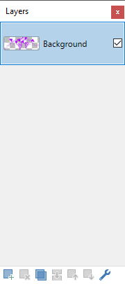
We will work with layers, which means there are numerous graphics that are laid on top of each other. Whatever is on the top of the list (in the graphic on right) may obscure all layers below it.
We will use this to our advantage.
Double-click on the layer to change the name, e.g., double-click on Background to change the name.
Note: When opening a graphic (e.g., JPG or PNG file) in Paint.NET, a layer named “Background” is created and the graphic is place in that layer. I normally change the name to something meaningful for the project I’m working on.
I normally place each object (graphics, text, shapes, gradients, etc.) each in their own layer. This allows me to manipulate each without touching (or damaging) anything else.
Layers can be adjusted using the icons at the bottom of the window. I’m not explaining them, other than to mentioned that the left-most icon adds a new layer and the one next to it deletes the selected layer. When deleting, make sure the correct one is selected.
Layers can be re-ordered by dragging-n-dropping, or by using the Up and Down icons.
Color Window
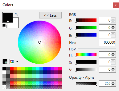
This window enables the user to change the color of whatever object is selected, and also affects what certain tools do, especially the Paint Bucket, Paintbrush, Pencil, Text, Shapes, Gradient, and Line / Curve tools.
The box in the upper left corner allows you to change the color used by the current tool. The small white triangle in the black box indicates that is what is selected. To change the color, click in the color wheel, select a color in the block of colors (bottom of window), enter RGB or HSV codes, OR type/paste a value into the Hex textbox.
I normally use a site that lists HTML colors including the hex codes, copy the one I want, and paste into the Hex textbox.
The secondary color box (white box below and behind the primary color box) changes the color if the tool in use has a secondary color. This includes filled shapes and gradients.
Click on the secondary box to select it (a small triangle will appear at the bottom of the box), and change the color in the same fashion as for the primary box.
Tools Window

I could write a 100 page post on what these tools do. When I mention a tool, mouse over each tool to see the tool tip that explains what each is. When in doubt, search for “paint.net” and the name of the tool.
Note: It’s beyond the scope of this post to provide a full explanation, but I will touch on key points for a few tools.
The Rectangle Select (upper left corner) is the selection tool I use most often. I rarely use the Lasso Select or the Ellipse Select tools. Once a selection has been made, use the Move Selected Pixels tool to move or rotate the selection.
The Magic Wand tool (4th down on left) selects irregular areas based upon color. This is especially useful for deleting backgrounds and changing colors. However — be cautious, as it can select more than is expected.
The Paint Bucket tool is used to change colors — choose a new color and click on an object. All items connected directly to it with a similar color will be changed. This one must also be used with caution.
The Paintbrush, Pencil, and Line / Curve tools default to 2 pixels wide. This value can be changed using the associated tool palette.
The Shapes and Gradient tool use 2 colors, so a secondary color must be chosen.
The Eraser tool does exactly that — use small strokes, as it’s very easy to destroy things unintentionally.
Finally, the Color Picker tool captures the color code of the pixel it’s clicked on, making it easy to capture a color to use for other tools.
Fixing the Grape Vine
Using the Windows Explorer, locate the graphic to manipulate. Right-click on it and select Open With … and choose Paint.NET.
The graphic will open and the Layers window will resemble the previous graphic. Double-click the name and rename “Background” to something that makes sense for your situation. I used “Vine 1”.
In the File menu, select Save As and create a Paint.net project (PDN file extension).
This avoids overwriting the original graphic, and if you need to come back later and update the work, creating a project file is absolutely necessary.
Transparent Background
We want a transparent background, meaning that anything that isn’t part of the graphic itself is transparent, so whatever is behind the graphic will display. The graphics I used did not have transparent backgrounds, so I opened the images in Paint.NET and carefully erased the background using the Erase tool.
The Magic Wand tool can be used — select the background area and type Delete. As already mentioned, use this tool cautiously.
This can be very painstaking and Ctrl-Z will prove itself to be your friend. If you have to do this, be patient and take your time.
Resize the Canvas
The workspace is called the “canvas”, and it’s typically about the size of the graphic. More space is required to allow for manipulation, so expand it. In the Image menu select Canvas Size …
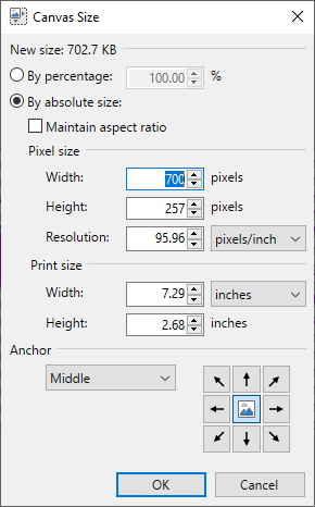
Whatever the Width and Height values are, double them. It doesn’t matter if this is in Pixels or Print size. Make sure the Anchor is Middle, as that will place the graphic in the middle of the resized canvas. Click OK to save.
Note: if the canvas appears way too large, don’t worry about it. As a final step the excess space will be removed.
The graphic will now appear something like the following. Note that the border shown does not exist — it’s added to this graphic so that the size of the canvas can be seen.
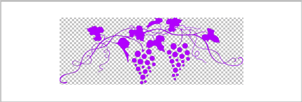
Note: The checkered background is Paint.NET’s way of showing that a transparent background exists. In the above graphic, the area behind the grape vine is transparent, but the white is actually a solid white background.
The extra space is typically white. Select the Magic Wand tool, click anywhere in the white space to select it, then press Delete. This deletes the white so the entire area other than the grape vine is transparent.

Make the Vines Brown
The color of the grapes is fine, but we need to change the color of the vine itself, plus the leaves. This will be done is 2 stages. While there are several ways this can be done, doing it with layers produces the cleanest result and honestly doesn’t require much drawing skills. Most importantly, I find it easiest to recover from mistakes.
In the Layers window, click the Add New Layer button to add a new layer. If it’s not above Vine 1 in the list, drag it so it’s first.
Double-click the new layer and rename it, e.g., “Vine 2”.
Click Vine 1 to select it, then use the Rectangle Select tool and draw a box around the graphic. Make sure the entire graphic is selected. Type Ctrl-C to copy the image to the clipboard.
Click layer Vine 2 to select it, then type Ctrl-V to paste the image into that layer.
Note: At this point, the copy of the image is directly above the original, so it appears nothing happened.
Click the checkbox on the right side of the Vine 1 entry in the Layers window to uncheck it. Again, nothing appears to happen, although layer Vine 1 is now invisible.
Click Vine 2 to ensure it is selected. Use the Erase tool to erase the grapes. DO NOT erase the vine or the leaves. The Brush Size can be changed — I normally make it larger to erase the largest features, then make it smaller for detailed work.
When done, click the checkbox for Vine 1 to enable it, and the grapes will appear. Keep in mind these are in layer Vine 1, not Vine 2.
I use htmlcolors.com among other sites to locate colors. Copy the desired hex code, and paste it into the Hex field in the Colors window.
Then use Paint Bucket tool to change the vines and leaves to the desired color, in this case brown. With both layers (Vine 1 and Vine 2) visible, the graphic now resembles this:
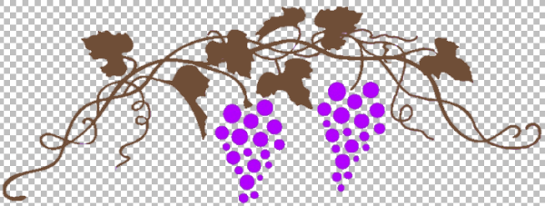
If the checkbox for Vine 2 is unchecked, the original purple graphic will be shown.
Make the Leaves Green
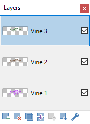
We are going to use the same exact process to make the leaves green. Make a new layer, in this case call it Vine 3, and ensure it’s at the top of the list. The Layers window will resemble this:
Uncheck the checkbox for Vine 1 to hide it. Click Vine 2 to ensure it is selected, and use the Rectangle Select tool to select the entire image. Type Ctrl-C to copy the image.
Click Vine 3 to select it, then type Ctrl-V to paste it. As before, it doesn’t appear anything has changed.
Uncheck the checkbox for Vine 2 to hide it. Ensure that Vine 3 is selected.
Use the Eraser tool to carefully erase the vine. I go carefully with this, as it’s more intricate. Work in short swipes, and use Ctrl-Z to undo mistakes. I started with a large brush size, the selected a smaller brush size to get in close to the leaves.
Choose a color to use, and enter it into the Hex field of the Colors window. Use the Paint Bucket tool tool to color the leaves.
Check the checkboxes for layers Vine 1 and Vine 2. The graphic now resembles this:
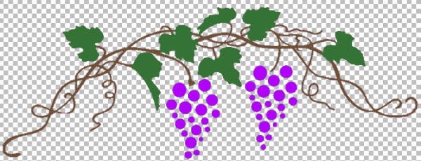
What we see is actually 3 graphics, stacked upon each other. The original purple graphic is on bottom. On top of that is the brown vines and leaves, which obscures the purple vines and leaves, and on top of that is the green leaves, which obscures the brown leaves.
Now we crop the graphic to make it smaller. Using the Rectangle Select tool, draw a box around the graphic as tightly as possible. Then select Image | Crop To Selection.
Save the project.
Then select File | Save As and save the graphic as a PNG file. We now have a colorized graphic that can be used in other projects.
Add the Sword
Open the sword graphic in Paint.NET to create a new project. Save the project file with a useful name, such as “sword & vine”.
Double-click the layer Background and rename it “Sword 1”.
Open the colorized vines PNG file in Paint.NET and use the Rectangle Select tool to select the graphic and type Ctrl-C to copy it.
Switch to the sword & vine project and select Edit | Paste into New Layer. If this is not first in the list, move it to the top. Rename the layer to “Vine 1”.
Click Vine 1 to ensure it’s selected, select the graphic with the Rectangle Select tool, and move it until it overlaps the sword and looks good.
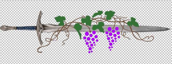
While this look fine, I want the vine to appear to wrap the sword, so we have more work to do.
Wrap the Vine Around the Sword
Create a new layer named “Sword 2”, and move it to the top of the list.
Uncheck Vine 1 to hide it.
Click on Sword 1 to select it, and use the Rectangle Select tool to select the section of the sword that is covered by the vine. Type Ctrl-C to copy it, click Sword 2 to select it, then Ctrl-V to paste it. As usual, nothing appears to happen.
Check Vine 1 to make it visible. Now it will appear that the sword is on top of the vine.
Click Sword 2 to ensure it is selected.
This is the only difficult part of this entire exercise. Use the Eraser tool to erase parts of the sword in Sword 2 to display parts of the vines, leaves, and grapes. Ctrl-Z will be used repeatedly, as it’s easy to make mistakes. Be patient and have fun!

As before, save the project, then save the graphic as a PNG file.
Why save numerous PNG files? I may want to use different parts, such as the colorized grape vine or the completed sword & vine graphic in different ways.
Build the Logo
Because the logo may be used on a background that doesn’t present it well, we are going to put it on a solid background.
Make yet another Paint.NET project. Use Magic Wand tool to delete the white background. I didn’t bother changing the name of this layer.
Open the sword/vine PNG file in Paint.NET, select it with the Rectangle Select tool, copy, and paste into a new layer in the new project. Rename this layer “Sword-Vine 1” and ensure it’s at the top of the list.
I chose to use the Shapes tool to draw a black oval with white fill in the Background layer.
Note: As long as drawing object is selected, you can adjust it. For shapes, this means moving by the handle and/or resizing it by dragging the outline. However, once the object no longer is selected, it’s not easily changeable. Make all the changes at once, and be prepared to start over again if you mess up. Putting objects like this in their own layer avoids impacting other graphical objects, and makes fixes easier.
I resized the oval and moved it so the sword & vine graphic is centered in it.
This version of the logo looks like this:
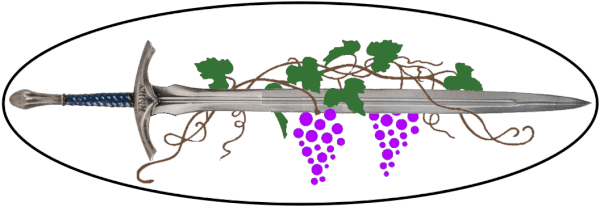
As before, save the project file and then save the graphic as a PNG file.
Why a Transparent Background?
I mentioned using a transparent background several times. In the following picture, the top logo has a transparent background, so the underlying image is visible all around it.
The bottom logo has an opaque background. Yes, I used the ugliest colors I could to emphasize the point.
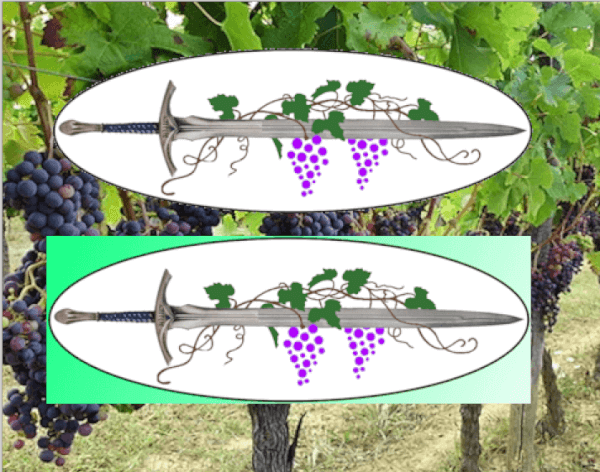
The transparent background avoids having the logo block out more than necessary of all objects that are behind it, which makes a better presentation.
