Wine Label Creation Process 01
updated 09 August 2023
August 2023
We are ramping up to bottle the Merlot/Grenache and Merlot/Tempranillo, so I checked the sample labels. We haven’t made a decision yet on which to use, but I’m satisfied with the Merlot/Grenache choices, but not the Merlot/Tempranillo, so I created a few new samples.
I also decided to make this post the first in a series. At some point in the future I’ll detail my process and decision making, when I have a situation that is sufficiently different so that it’s worth your time to read, and mine to create.
How I Do It
Current Experimentation
2022 Tempranillo
2022 Merlot / Grenache
2022 Merlot / Tempranillo
2022 Mourvèdre / Petite Sirah / Syrah
How I Do It
I often create wine labels early in the winemaking process, sometimes starting during fermentation. This provides an outlet for my creative urges, and gives me time to develop and fine tune designs. I develop a design I like, then later come back and tweak it, as I spot things that aren’t lined up, or sometimes I get a better idea. This has happened twice in the last 6 months as I received a very nice picture from an online acquaintance, and I captured a really good picture of dawn at North Myrtle Beach — in both cases I scrapped the previously chosen design for a new one.
In recent years my labels have a graphic as a background — initially I used Paint.NET (free graphics program) to fade the image, as a lighter image is much easier to superimpose text on. However, full color graphics may look better on the bottle, so more recent labels use unfaded graphics, which makes label creation significantly harder.
A friend commented last night that I put a lot of effort into making labels. As much as I appreciate the compliment, it’s not quite accurate. I’ve been making wine labels since the late 80’s, and I’ve done so many that it’s gotten easy.
Since 2006 I’ve used Avery Design & Print, a no-longer-supported desktop application by Avery (they have an online version which I don’t like as much). I have a standard label format (that has morphed over the years), so I open an old design as a starting point, swap out the background graphic, update the text, change font face and color, and move the text around to fit the background.
Why Avery? I use Avery-type labels, and Design & Print has a template for every type that Avery sells. Additionally, it enables me to create one label, and it flawlessly scales that on the page to fill every slot, regardless if the page holds 2 labels or 12. Other programs may have more features, but this one works well for my needs.
I can create a brand new label in as little as 5 minutes, or as long as 1 hour.
What takes the time is finding the background graphics and manipulating them. Many look great, but don’t work because I cannot reasonably place readable text on the graphic. Some look great, but need adjusting, including stretching them to ensure the label background is covered while ensuring main elements are not obscured by text. This often takes the most time.
I’ve gotten good at picking-n-choosing, so I don’t waste a lot of time messing with graphics that won’t work, but choosing is still more of an art than science, and in general searching takes time. This is actually ok, as it’s entertaining, even if I don’t get a positive result from it.
At this time I have 2 templates, mine and my elder son’s, as I create labels for him. All labels have common elements:
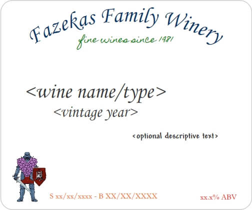
Note: When Eric and I collaborate on a batch, we bottle some of the batch with my label, and some with his.
A couple of years ago I changed the Winery Name from “The Fazekas Winery” to “Fazekas Family Winery” when Eric migrated from being assistant to co-winemaker. The Tagline “fine wines since 1981” was first put on stick pens in the late 80’s, and carried forward to my labels.
The Grape Warrior logo has been on my labels for over 10 years, although I recently shrunk it in size and place it in the lower left (and sometimes right) corner.
Previously I had just the Bottling Date (“B”) on the label, but recently put the Start Date (“S”) as well. The ABV (Alcohol By Volume) has been on the labels for years.
The font face and font size for the Winery Name, Tagline, Dates, and ABV are standard. I may change them in the future, but have no plans to do so. Generally speaking, for all wines of a given year, these elements will not change.
Depending on the background graphic, the font color changes to ensure these elements are clearly readable on the label.
The Wine Name/Type and Vintage Year vary greatly, depending upon the background graphic and the wine type. The Descriptive Text is usually, but not always present, and varies like the other elements.
Eric’s template has his logo (Sword and Vine) where my Tagline is place.
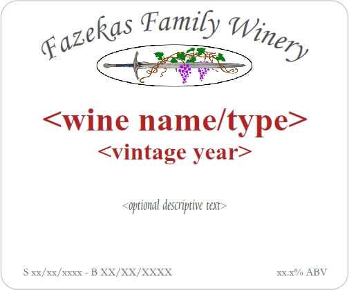
The two templates illustrate how the other other elements vary. It’s actually rare for me to NOT change the font face, font size, and color of the Wine Name/Type, Vintage Year, and Descriptive Text.
Current Experimentation
This section of this post will change periodically, as I experiment with labels for in-progress wines. I’m not necessarily keeping a history, so as wines are bottled, the previous experiments may be deleted. Or I may leave them.
Note: Unless otherwise specified, all grapes are trucked from California.
2022 Grenache
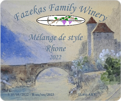
This one is listed as a “Rhone”, as while the main batch is Grenache (a Southern Rhone grape), a field blend of Mourvèdre, Petite Sirah, and Syrah will be blended into it. This is a common southern Rhone style blend, well, everything except Petite Sirah.
Oddly enough, Petite Sirah was developed in France for the Rhone region, but is not grown there although it’s popular around the world. The Rhone Rangers group of California (all members grow Rhone grapes) consider Petite Sirah a Rhone grape due to its origins, and that’s good enough for me.
Sample #1 is actually the 7th design, as I tried fading the background graphic, but we (Eric, Shannon, and me) agreed the original picture looked much better. I also moved the graphic around so the Winery Name doesn’t cover the towers. This is the result.
Last fall I took a great picture of dawn at North Myrtle Beach, and tried that as a label background. This gave me an idea for a name, which is great since I generally suck at making up names. The version presented is also the result of several iterations.
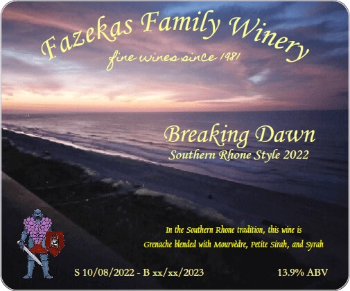
Shannon & I like the new design, but Eric prefers #1. While in the past the Bryan & Eric labels are variations on each other, I realized we didn’t have to do that. My solution is to label part of the batch with label #1, and the remainder with #2. Everyone is happy, and I like the idea of having both labels in my racks.
Other than fixing the dates and validating the ABV, I do not expect these labels to change before we bottle in November.
2022 Tempranillo
The Tempranillo will probably be blended with the above mentioned blending wine, although we will do a blind taste test to determine what we want. I expect the percentage used to be lower, so the name is “Tempranillo”.
Note: In the USA, if a wine contains at least 75% of a varietal all grown in the same appellation, the winery can use the varietal name on the label. While I am an amateur winemaker and do not sell wine, I generally follow the rule as it makes sense.
Given that Tempranillo is a Spanish varietal, I went with Spanish dancers, finding two pictures I really liked.
The problem? Both pictures are of just the dancer, with minimal background, so the text covers the dancer, and not in a good way. Using Paint.NET, I carefully stretched the backgrounds so I could place the dancer in the lower right corner.
The hard part is deciding which I like better.
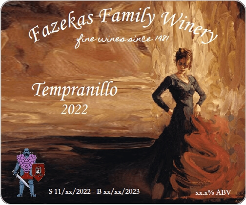
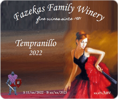
This is a tough decision, although I’m leaning towards #2. Regardless, it’s very likely that whichever graphic doesn’t get used this time will get used for a wine in the future.
2022 Merlot / Grenache
I tried two experiments last fall — for the first one, I took a Finer Wine Kits Tavola Merlot and added to it the pomace (grape solids) from the Grenache instead of skin packs. For the second experiment I took an identical kit and added the pomace from the Tempranillo.
So far both wines are turning out well and will be bottled soon. Last night I realized I have yet to create labels for them, so I spent a few hours while watching TV working on labels. The result was the following:
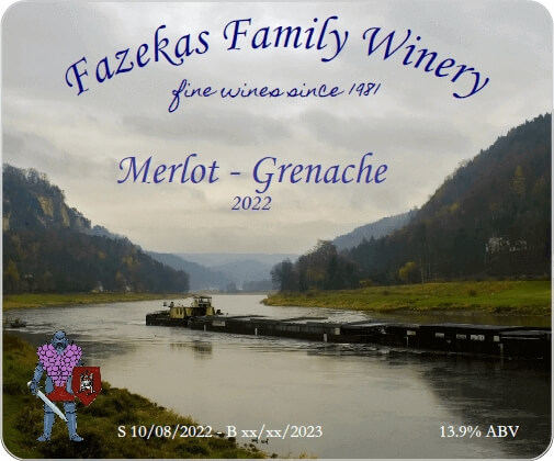
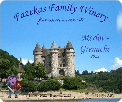
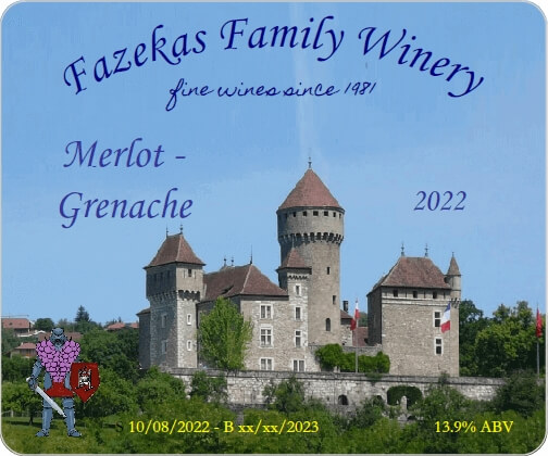
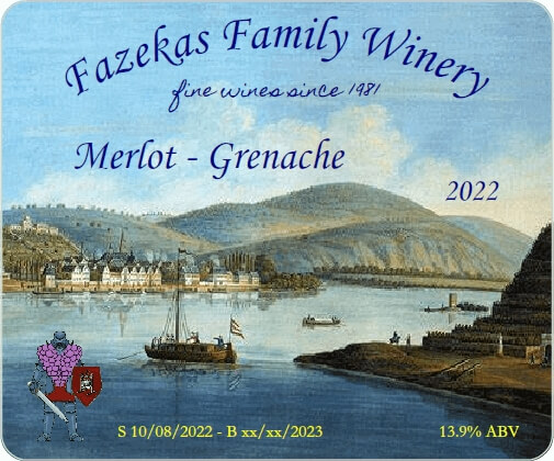
At this time I’m leaning towards #4 as I like the painting and it’s different from a Chateau / castle.
2022 Merlot / Tempranillo
Given that Tempranillo is a Rioja grape, I again used a dancer theme for my first sample. What can I say? I love watching Spanish dancers.
This one is a photo, not a painting, so it’s different from the Tempranillo in that respect.
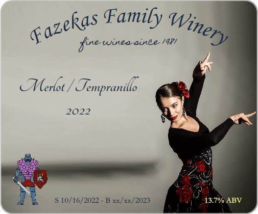
Then I decided to go in a different direction:
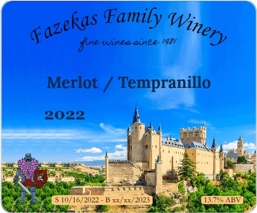
This last one illustrates a problem with some graphics — I had to put a background behind the Dates and ABV text to make them visible, which can negatively impact the visual effect. I may try another castle as a background, but this one will probably get nuked.
It occurred to me to do a solid bar at the bottom:
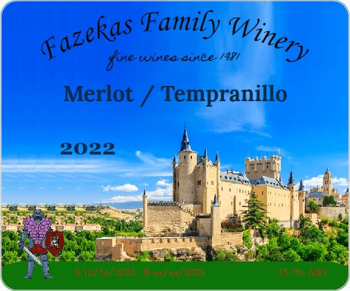
In looking at Sample #3, I realize the font colors are not working, so I tried something different:
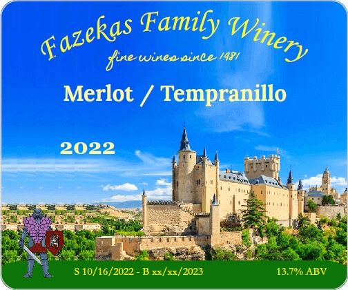
Unfortunately, the color shows up great, the text is very readable, but at first blush the label seems garish. I’ll experiment with a darker yellow, just to see if I can make it work. I’m already fairly sure this one won’t make the cut.
Updated August 2023
After reviewing the samples, I decided I needed more. While I like #1, the grey background may be too dismal. Yeah, it emphasizes dancer, but I’m not sure I’m happy with it.
Samples #2 through #4 are great examples of what NOT do to. While I like the graphic, it just doesn’t work for a label in the style I want.
I searched for more Spanish castles and wineries, but could not find anything that will work for me. Keep in mind these don’t work for me and my style — someone else might use them just fine.
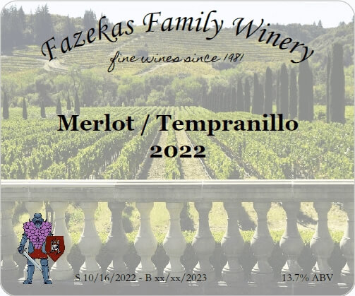
Last night I found more dancers, plus went in a couple of other directions. For Sample #5, I went back to a previous paradigm and faded the photo of a vineyard:
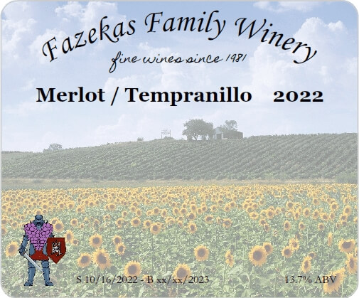
For Sample #6 I tried a different type of field, sunflowers. While I really like this as a label, in my opinion it’s better suited for a white wine, so I’m keeping the label as a sample for one of this fall’s whites. This proves that there is little waste in my efforts!
In this next sample, I found another dancer:
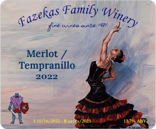
Stretching the background on this one was not an easy task, but Ctrl-Z is my friend — when a stretch isn’t working, I back out the changes until I get to the last good one, then continue stretching. Please note that my idea of difficult is that it took 5 minutes instead of 30 seconds.
Sample #8 looked better with the dancer on the left, so I moved my logo to the right.
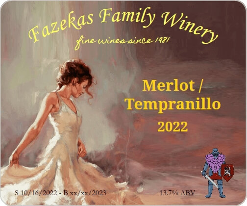
This one was harder to pick colors. I tried reds and browns for the text, but it was easier unreadable or just didn’t look good. I use Paint.NET’s color picker tool to get the color code for a spot (it’s a hexadecimal value), and look up complementary colors on various web sites to get close. Then I use another site that lists codes for every color you can imagine, and do a lot of trying. This one took a lot of tries, but honestly only took about 10 to 15 minutes to get what I wanted.
Shannon and Eric have been sent the choices, and I’m waiting on their feedback.
2022 Mourvèdre / Petite Sirah / Syrah
At this time I’m not making a label for this batch. Although I have 8 gallons of it, a fair amount will be blended into the Grenache, and some may be blended into the Tempranillo, and there may be none left to bottle as a separate wine.
If I need a label, I’ll probably re-purpose one of the Merlot/Grenache labels, whichever is #2.

I LOVE the Breaking Dawn label and of course the Spanish dancer. Great job!
Thanks!
Can you get the labels off and reuse the bottle
Absolutely! My labels come off easily when soaking in hot water for 30 minutes. For the first time bottle, I add a scoop of Oxyclean and soak for an hour. Some peel right off, others require scraping. If there is glue residue I use Goo Gone, then wash with soap.